
About Shair Air Quality Categories
Various colors are used to communicate air pollution concentrations and they don’t always mean the same thing. Here is what our colors mean and why, as well as some background on the traditional Air Quality Index colors.
| Color | Category | 1-hour Average Concentration | ||
| PM2.5 (µg/m3) |
PM10 (µg/m3) |
NO2 (ppb) |
||
| Very Low | 0 – 5 | 0 – 10 | 0 – 10 | |
| Low | 5 – 10 | 10 – 20 | 10 – 20 | |
| Moderate | 10 – 25 | 20 – 50 | 20 – 40 | |
| High | 25 – 50 | 50 – 100 | 40 – 60 | |
| Very High | > 50 | > 100 | > 60 | |
| Color | 1-hour Average Concentration | ||
| PM2.5 (µg/m3) |
PM10 (µg/m3) |
NO2 (ppb) |
|
| Very Low | 0 – 5 | 0 – 10 | 0 – 10 |
| Low | 5 – 10 | 10 – 20 | 10 – 20 |
| Moderate | 10 – 25 | 20 – 50 | 20 – 40 |
| High | 25 – 50 | 50 – 100 | 40 – 60 |
| Very High | > 50 | > 100 | > 60 |
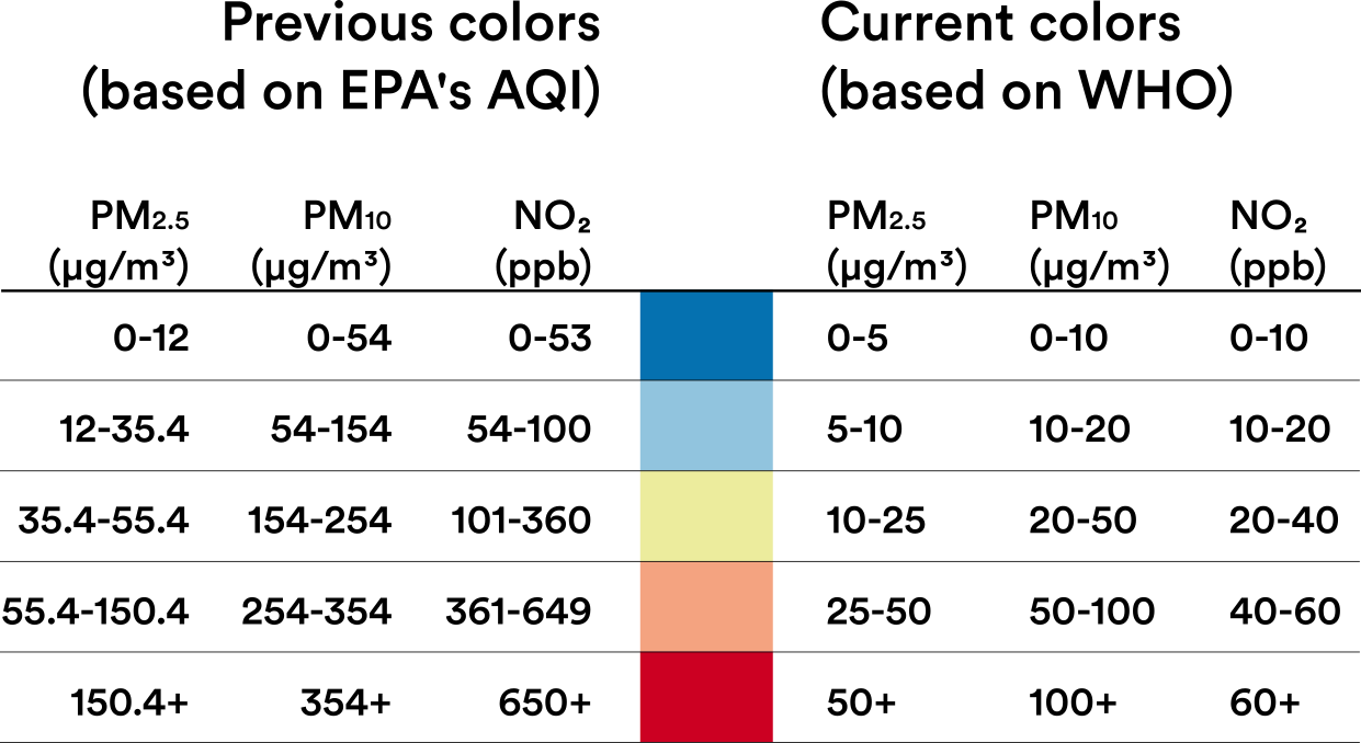
On March 5, 2020, we revised the Richmond Shair color scheme to be more aligned with the World Health Organization (WHO) health guidelines. Our top priority at Shair is to make sure data is valuable and useful to those that are using it — so that data can be the lever for action and change in our communities. For that, we need to present our models with a smaller scale — a more health protective scale. For this reason, we looked to the World Health Organization (WHO) and the Breathe London project to guide the new Shair color scale.
As of today, our hourly real-time data reflects a more protective scale than that of the US Environmental Protection Agency (EPA) Air Quality Index (AQI) scale— so that the community can see clearly how air quality is changing hour-by-hour, and year over year. The table below shows a side-by-side comparison of the previous color bins with the revised color bins. We welcome any and all feedback from our users so we can continue to enable people from every walk of life to see the truths of air quality, with clarity.
More information on the colors we use are discussed on our blog post, Shair revised the color scale - why?
Information about the air quality index colors scales we’ve referenced can be found below:
- World Health Organization (WHO) Fact Sheet on Outdoor Air Quality
- Breathe London Project Air Quality Scale