
When we first launched Shair in Richmond back in December 2019, the Shair team decided to use the US Environmental Protection Agency (EPA) Air Quality Index (AQI) scale for PM2.5, PM10, and NO2 for our hourly real-time model data. Because the AQI is an index for reporting daily air quality (24-hour averages) based on data collected from reference grade monitoring equipment, we decided to not use the exact same colors (from green to purple) so as to not confuse the type of data we were presenting. There are so many different types of data in the air quality space, with varying degrees of quality and time averaging, that all of the different colors and messaging can be confusing! So we started with a blue-to-red color scale representing AQI categories that everyone is familiar with.
Two months later, we learned that our maps were not always useful. Why?
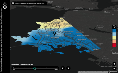
Because we were missing a lot of variation in air quality across Richmond that only spanned the first one or two AQI categories. We would, at times, span into the third or fourth colors bins (the yellow and orange colors) but these were for events like New Years fireworks or a regional event consisting of calm winds and a low boundary layer trapping pollutants at ground level. We recognize that variation in air quality pollutant concentrations, and therefore exposures, exist nearly all of the time, but our maps were not showing those variations with our AQI-guided color scale. It became clear that the bin concentration thresholds meant for a 24-hour time-scale from regional air monitoring stations reporting the EPA AQI standard were not a good representation of the concentration levels reported from our 10-meter resolution, hourly real-time model and measurement.
Our top priority at Shair is to make sure data is valuable and useful to those that are using it — so that data can be the lever for action and change in our communities. For that, we need to present our models with a smaller scale — a more health protective scale. For this reason, we looked to the World Health Organization (WHO) and the Breathe London project to guide the new Shair color scale.
As of today, our hourly real-time data reflects a more protective scale — so that the community can see clearly how air quality is changing hour-by-hour, and year over year. The table below shows a side-by-side comparison of the previous color bins with the revised color bins. We welcome any and all feedback from our users so we can continue to enable people from every walk of life to see the truths of air quality, with clarity.
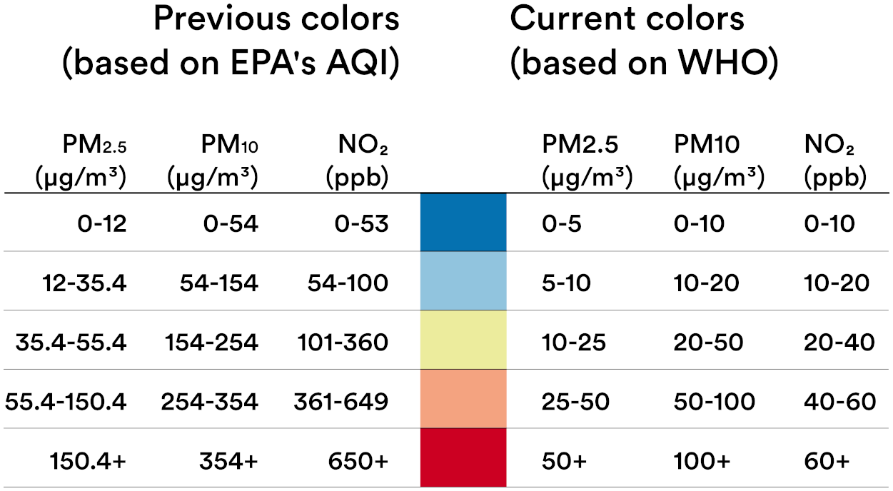
Previous color scale (left) versus revised color scale (right) as of March 5, 2020
Want to chat with us or see a demo? Please reach out to use at shair@ramboll.com.