Background
Air pollution is a major cause of ill-health and death worldwide, accounting for approximately 5 million deaths every year — roughly 10% of all global deaths (IHME, 2019). Despite the tendency of air pollution concentrations to vary sharply over short distances, more than half of the world’s population has no monitoring at all for pollutants that are leading global mortality risk factors (Martin, et al., 2019). While air quality monitoring efforts that involve the direct measurement of pollution concentrations at a high spatial resolution are on the rise, it cannot be expected that these methods will be performed and maintained in all parts of the world in the immediate future. It is thus necessary to devise other methods of understanding the distributions of these pollutants. This can be accomplished by analyzing the relationship of a variety of local factors — such as traffic, industrial activity, and power plants — with directly measured pollution concentrations in areas in which this information is available. Understanding these relationships may allow us to infer information about air pollution distributions that provides valuable health-relevant information.
Motivation
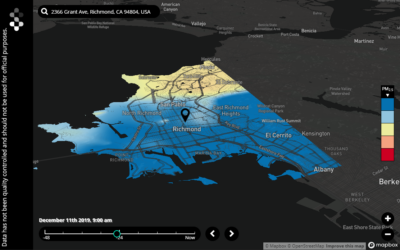
In late May 2015, investigators from the University of Texas at Austin, the Environmental Defense Fund, Aclima, and several other universities set out to develop high spatial resolution air quality maps of a 30 km² area of Oakland, CA in an effort to fill the voids left by traditional air quality monitoring methods such as sparse reference monitoring, satellite remote sensing, and dispersion modeling (Apte, et al., 2017). Their approach? Attach pollution-monitoring sensors to Google Street View cars, which would spend nearly 8 hours every weekday driving around the sample area for almost a full year, amassing a data set of approximately 3 million pollution concentration samples. A rigorous data reduction algorithm was applied to reduce these raw data down to approximately 21,000 median annual concentration values spread out among 30-meter road segments. Air quality maps were then generated.
Unsurprisingly, the areas with the highest pollution concentrations tended to be around major highways. Additionally, multiple daytime “hotspots” were identified, the majority of which turned out to be heavily trafficked industrial areas. Accordingly, a considerable correlation between traffic and air pollution concentrations was suspected, the existence of which would pose a variety of questions. First, could it be possible to infer certain aspects of the resultant high spatial resolution air quality maps with traffic data alone? Second, if a simple bivariate correlation as such gave us this ability, could there potentially be other variables or data out there with relationships to pollution concentrations that might enhance our ability to infer more information about these air quality maps in areas without such resource intensive air sampling campaigns?
Methods
The investigation of this suspected relationship between traffic counts and air pollution concentrations began with the acquisition of average annual daily traffic (AADT) data from June 2015 through June 2016 for 139 locations throughout the Oakland area. Due to the reduction of the raw Street View pollution data to annual median concentrations for 30-meter road segments of the sample area in the initial study, it was determined that any major relationship between traffic and pollution concentrations would likely manifest itself in the comparison of these reduced data to AADT data seeing as they were both annual estimates of central tendency. Scripting techniques were than used to automate the process of matching each traffic count location with its 3 nearest measurements of median annual pollution concentrations, which were then averaged. Traffic count locations matched to pollution data points greater than 30 meters away were removed from the data set, ensuring that any potential correlation was not skewed by dilution of the pollution concentrations in question. How do we know that this cutoff of 30 meters isn’t, itself, far enough to dilute a relational signal? To answer this, the distance-decay relationships presented by the authors of NO, NO₂, and Black Carbon (BC) — the three pollutants sampled in the initial study — were examined. It was found that, at a distance of 30 meters from their source, concentrations tended to remain at approximately 85–95% of their initial values (Figure 1). This suggested that any major trends in the data would not be lost by matching a traffic count location with pollution concentrations up to 30 meters away.
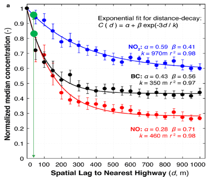
Figure 1. Distance-decay relationships for NO, NO2, and Black Carbon as a function of distance from a highway, a common source of emissions of each pollutant (Figure from Apte et al., 2017)
Results
When AADT data were initially plotted against the averaged median annual concentrations, little to no correlation was observed (Figure 2). However, DBSCAN, a machine learning clustering algorithm, confirmed what initial visual observations had indicated — that 2 distinct populations were present within the data (Figure 3). There appeared to be 1 cluster with low AADT counts (cluster A in Figure 3) that exhibited no relationship with pollution concentrations, while the other (cluster B in Figure 3) exhibited a more expected linear relationship with pollution concentrations across a dynamic range of the AADT values present in the data.
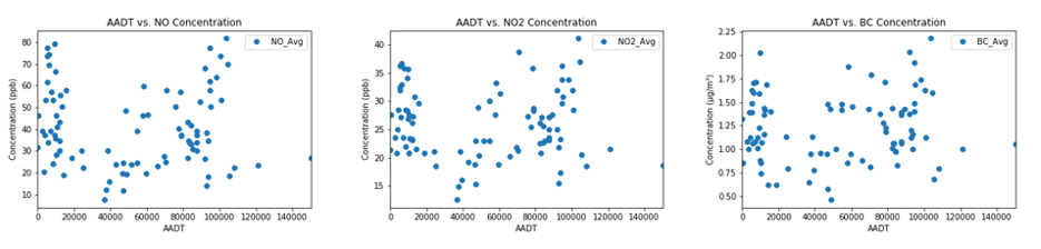
Figure 2. Initial plots of AADT vs. pollutant concentration for NO, NO2, and BC.
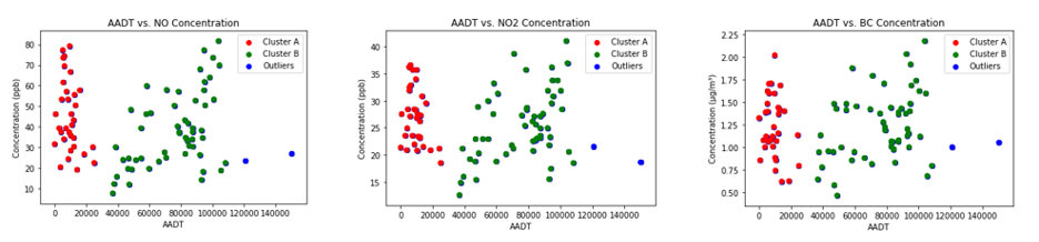
Figure 3. Clusters and outliers (points not included in a cluster) recognized by DBSCAN in the initial plots of AADT vs. pollutant concentration for NO, NO2, and BC.
Further investigation revealed that the majority of the points comprising cluster A had the distinguishing characteristic of being on or off ramps to major highways, and it was suspected that the associated pollution concentrations were heavily influenced by Street View data from the corresponding freeway. Removing the on and off ramps from the data and plotting the results revealed an almost exact replica of cluster B; for all 3 pollutants, over 90% of cluster A was removed while 100% of cluster B was retained. This confirmed the relationships suspected by visual observations and DBSCAN. The revised data for NO, NO₂, and BC exhibited coefficients of determination (r²) of 0.29, 0.22, and 0.20, and root mean squared error (RMSE) values of 14.9 ppb, 5.5 ppb, and 0.3 μg/m³, respectively.
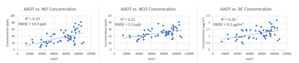
Figure 4. Plots of AADT vs. pollutant concentration for NO, NO2, and BC with data from on and off ramps removed.
It is suspected that the data may be skewed by further outliers not identified by DBSCAN from local sources such as truck yards and overlapping highways, resulting in disproportionately high pollution concentrations. A further analysis is required to justify the removal of these data points, which would likely result in a substantial increase of the coefficients of determination.
Discussion
What do these correlations between AADT counts and pollution concentrations mean? The moderate r² and RMSE values indicate that traffic data reveal a considerable amount of information about local air quality; information about traffic in a given sample area allows us to infer the spatial distribution of major emitters of several air pollutants. It is reasonable to believe that this relationship might translate into insights on actual pollution concentration, as well. However, the limited extent of this correlation observed between AADT and pollution concentration also reveals that other factors are likely to play an important role in local air quality as well. What are these other factors? Could we find a similar correlation between these factors and the distribution of air pollution? If so, high spatial resolution air quality maps could potentially be inferred with reliability, yielding valuable information about local air quality where costly Street View measurements have not been performed. Recent literature reveals that advanced data analytics techniques used to encompass the array of non-traffic factors involved in local air quality — such as meteorological conditions (and seasonal changes within them) and emissions from marine vessels and power plants — may give us a useful understanding of the distribution of pollution in a given area (Zhang & Ding, 2017). Such advances are encouraging signs that the understanding of air pollution distribution on a meso or micro scale may be possible without resource-intensive methods like Street View style monitoring and may exist in areas where this is not possible.
Acknowledgements
This work was conducted as an extension of prior work performed by Ayah Hassan of Ramboll and Jonathan Chou, formerly of Ramboll. Additionally, substantial contributions to this work were made by Drew Hill of Ramboll Shair. Jack performed this assessment while an intern at Ramboll.
References
Apte, J., Messier, K. P., Gani, S., Brauer, M., Kirchstetter, T. W., Lunden, M. M., . . . Hamburg, S. P. (2017). High-Resolution Air Pollution Mapping with Google Street View Cars: Exploiting Big Data. Environmental Science & Technology, 6999–7008.
IHME. (2019, August 29). Retrieved from GBD Compare: https://vizhub.healthdata.org/gbd-compare/
Martin, R. V., Brauer, M., Donkelaar, A. v., Shaddick, G., Narain, U., & Dey, S. (2019). No one knows which city has the highest concentration of fine particulate matter. Atmospheric Environment.
Zhang, J., & Ding, W. (2017). Prediction of Air Pollutants Concentration Based on an Extreme Learning Machine: The Case of Hong Kong. Environmental Research and Public Health.