Shair Walkthrough
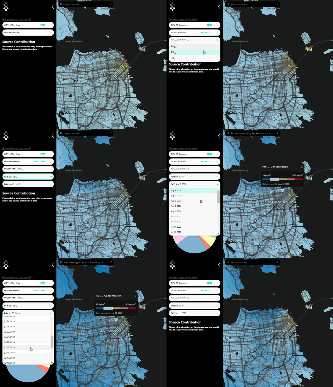
The Shair Map visualizes San Francisco Bay Area and Richmond, California Shair model results. Hourly average sensor measurements, model concentrations, and source contributions for the most recent 48 hours can be viewed in the Nowcast Mode. For "Pro" users subscribed to Shair Tech, the Historical Mode provides model concentrations and source contributions at every grid cell for multiple averaging periods (e.g. daily, weekly, monthly). The following walkthrough demonstrates the Shair Map and Shair Tech features.
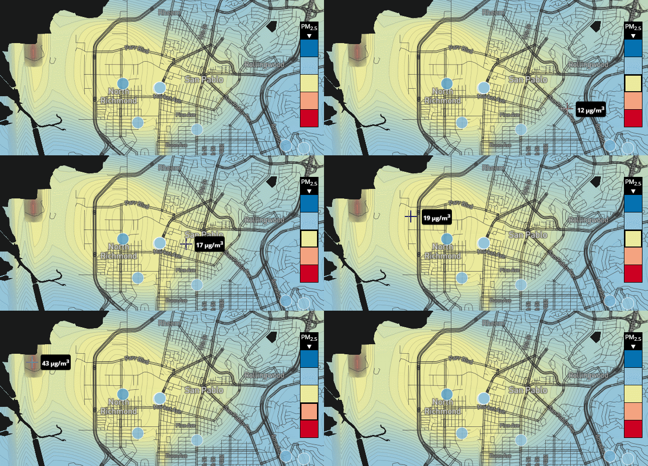
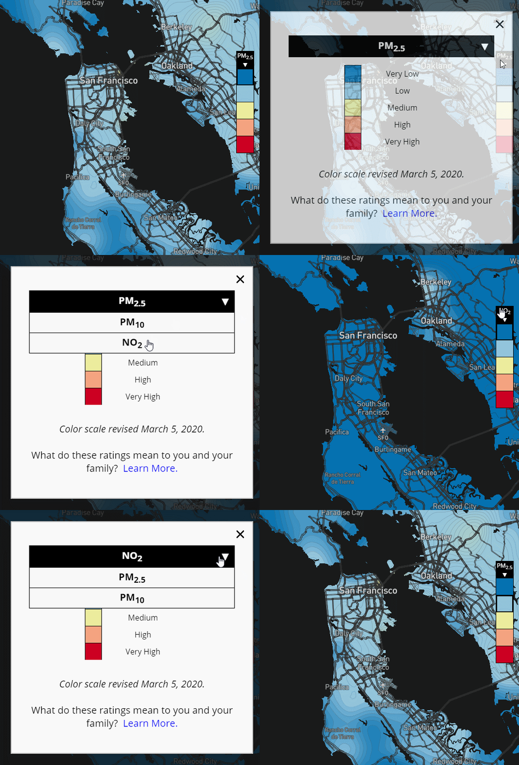
Multiple air pollutants are modeled with Shair. The Shair Map used a fixed color scale based on World Health Organization (WHO) criteria for each pollutant: dark blue represents very low concentrations and dark red represents very high concentrations. The legend changes to highlight the air quality concentration category directly under your mouse cursor. On mobile and other touch devices, the legend changes to highlight the category at the last location touched.
Click the legend to change pollutant and learn more about our WHO-inspired colors for Particulate Matter less than 10 microns (PM10), Particulate Matter less than 2.5 microns (PM2.5) and Nitrogen Dioxide (NO2).
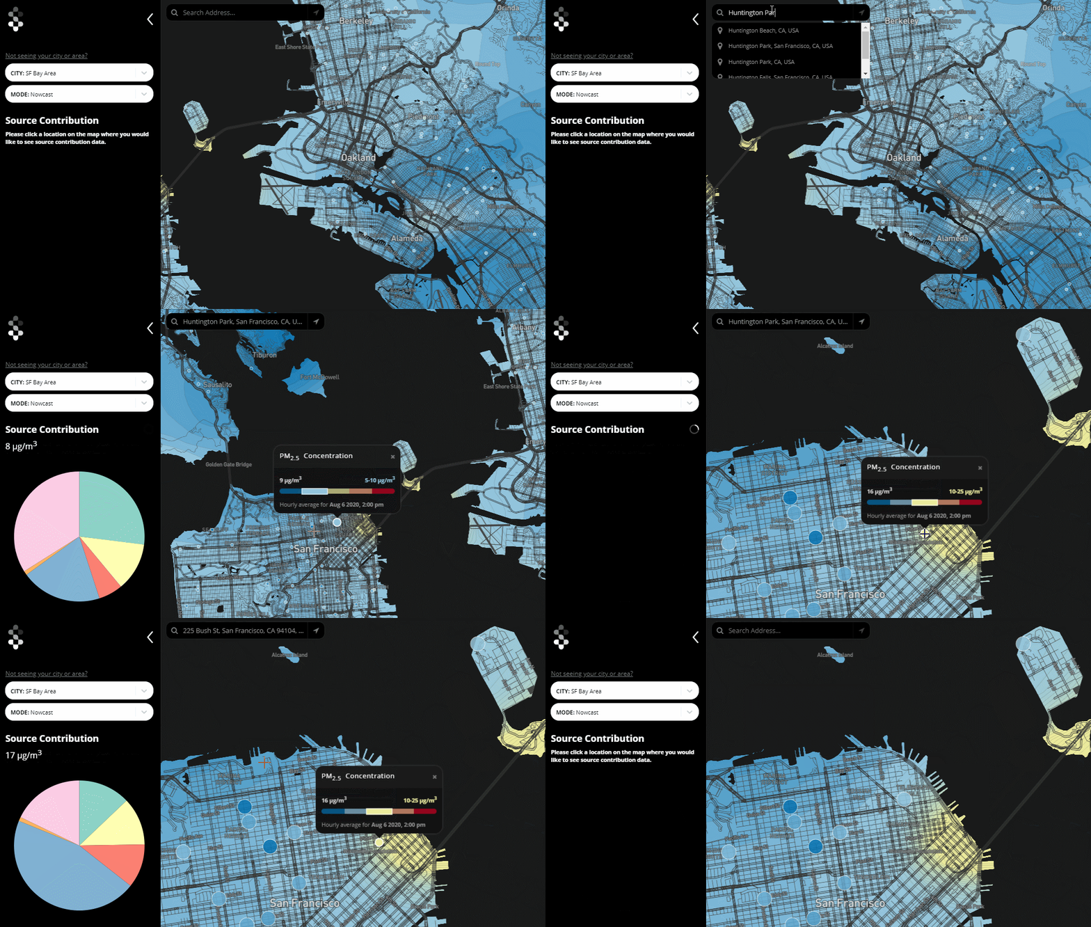
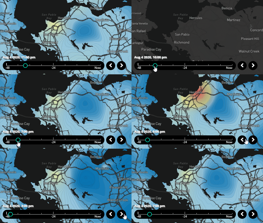
Use the time-slider to change the current hour in the Nowcast Mode. Drag the time-slider or click the forward or back buttons to view hourly average measurements and results from the most recent 48 hours. The timestamp above the time-slider bar tells you what day and hour the map represents.
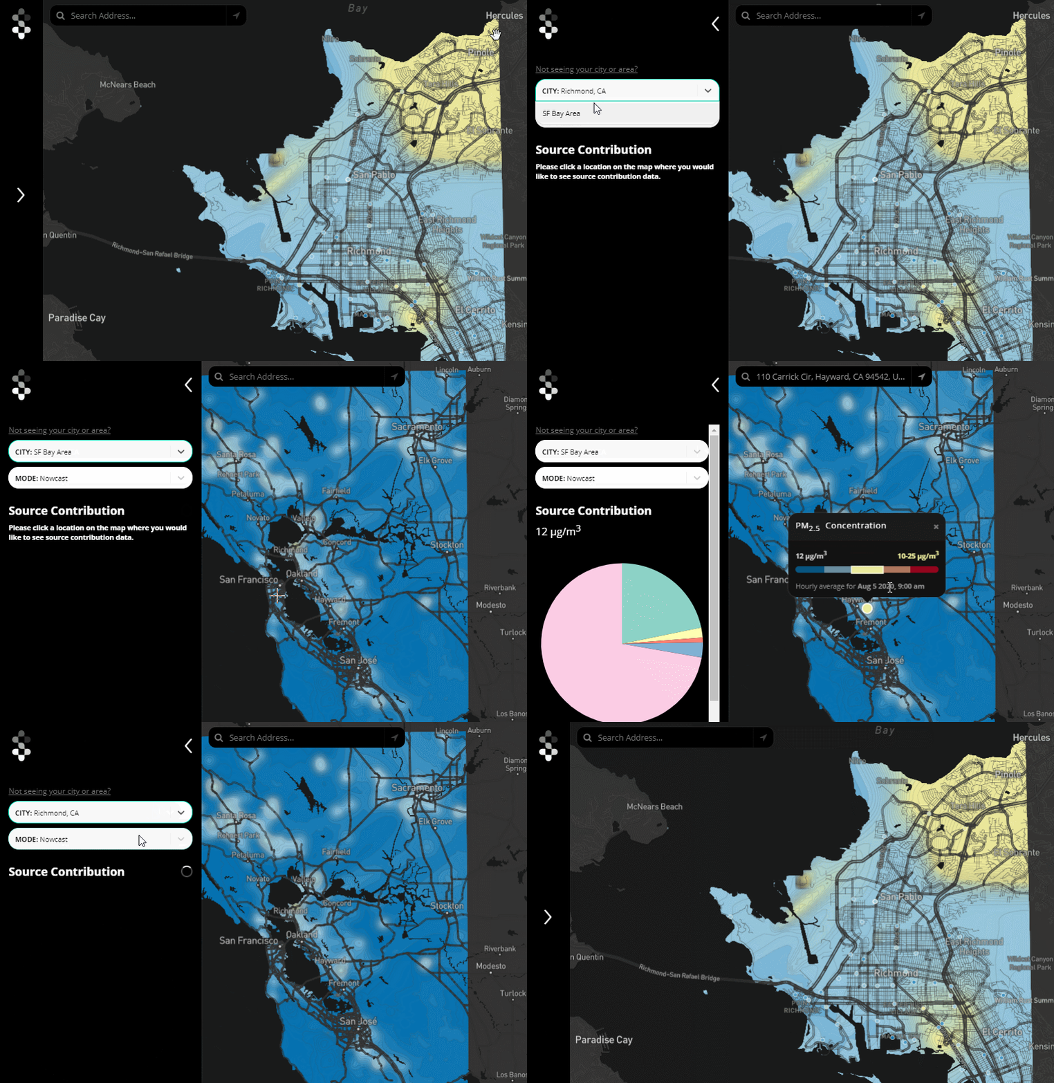
“Pro” users subscribed to Shair Tech can view historical concentrations and source contributions for longer averaging periods as they become available on the Shair platform. Historical results stretch back to the launch of Shair for each area. The map and source contributions update when you select a new date or averaging period.
