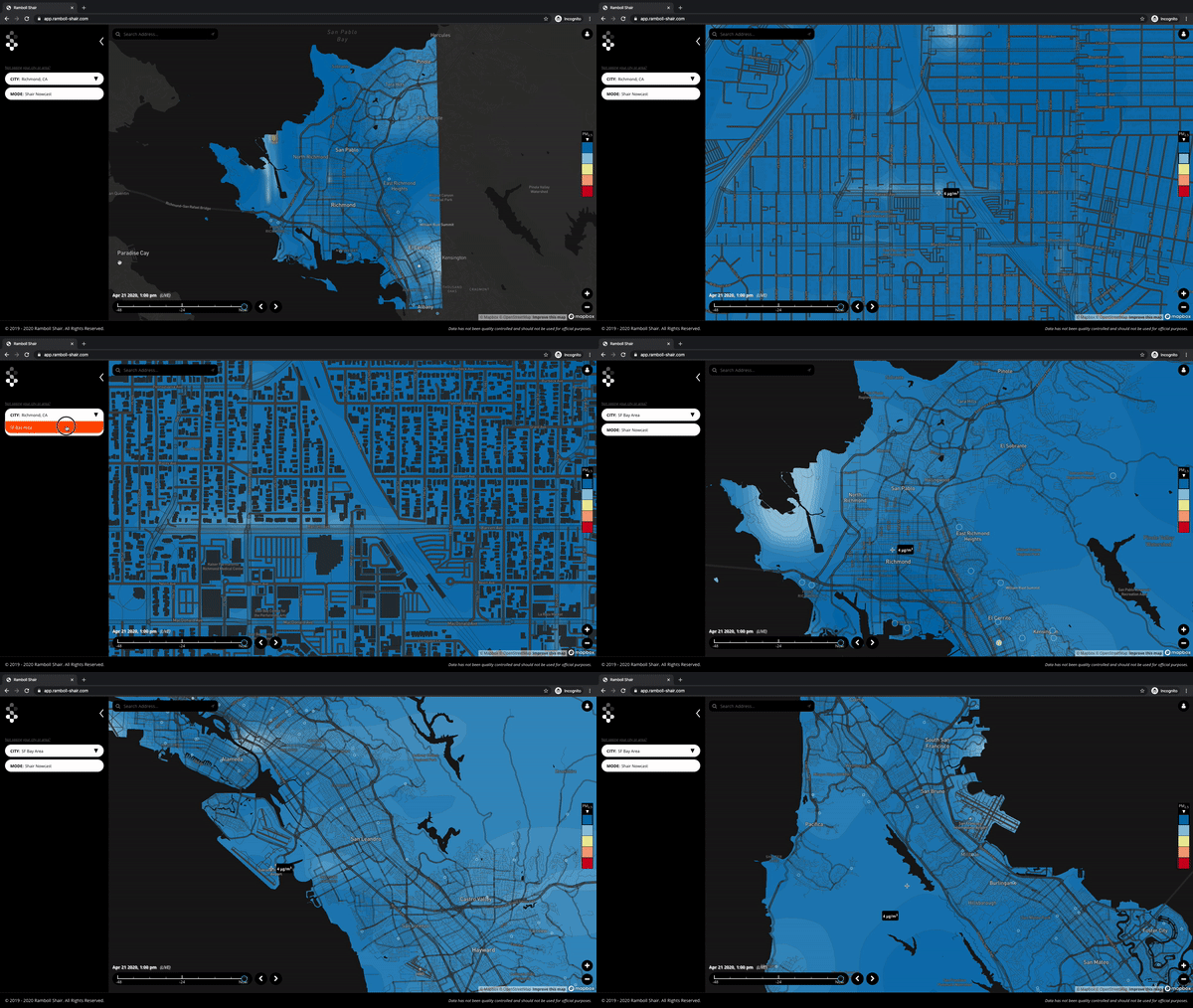
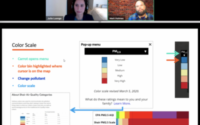
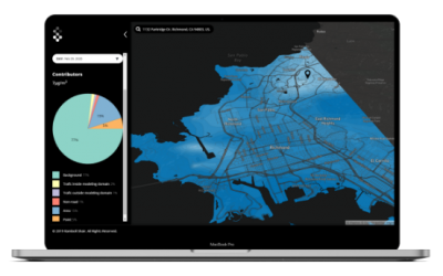
This Earth Day, the Shair team is excited to commemorate 50 years of environmental protection by launching the expanded Shair map, now covering all 9 counties of the Bay Area.

As we celebrate the success of the first Earth Day protest that led to the United States’ modern environmental regulation framework, the on-going pandemic makes the symbiotic relationship between human health and the environment especially poignant. With early studies linking COVID-19 health outcomes to the uneven pollution burden disadvantaged communities carry, it’s clearer now than ever that we still have work to do to build an environmentally resilient future. 50 years later, we need to build the same momentum and vision of the original Earth Day protest, while taking new approaches to solve our problems.
Shair is designed to push that environmental conversation forward. Our approach is rooted in the idea that getting to a shared understanding of the air based on quality data is the first step to clearing it. We’re delighted that by expanding our regional* map, we are reaching more communities at a pivotal moment in the conversation around how the environment impacts human health. We are equally excited to share some initial findings on how our map is performing based on the inputs into our model, and start the conversation on where to go next, below.
Finding 1: Sensor density can have significant effect on modeled results, but it’s not everything
We assimilate sensor measurement data into our model results; modeling a large area like the SF Bay Area is demonstrating the different ways sensor density affects our results. There are locations in the map where a single sensor is having a visibly significant impact on the map. This occurs in areas of low sensor density, where the model assimilates a very small number of sensors for a large area. In other areas with better sensor density, the area of effect for every individual sensor is smaller, reducing the ability of a single sensor to affect the results. Yet another visible outcome of the model’s sensor assimilation is in areas with dense and high emissions calculated from other inputs, like emissions inventories. In those cases, high pollutant concentration estimates persist even when there are nearby sensors with measurements that do not match the model. This shows the limitations of using only measurement data to improve model performance, and where we need to investigate and refine the inputs affecting the model.
Finding 2: The shelter-in-place policy highlights how ‘business as usual’ emissions inventory data doesn’t work
Most of the emission inventories that feed into Shair were created with the purpose of covering a large area and reflect average or most common conditions. However, this does not always match the ground truth as measured by the sensor network. This is obvious in the map in the large plumes appearing in San Francisco over the Embarcadero, the Financial District and SOMA. At this point in time, it is very likely that with the current shelter-in-place orders, the emissions provided by the inventory for this area are significantly lower and the sensors more accurately reflect this than the model. This is an opportunity to spark a discussion on where, and how, emissions inventories can be refined to better reflect real-time conditions.
Finding 3: The impact of meteorology and elevation
We notice that Shair often predicts high concentrations around the Embarcadero, Financial District and SOMA. In addition, areas with similar emissions do not always exhibit such high concentrations and this is because meteorology and terrain elevation are also playing a role. This area is flatter and lower than the surrounding neighborhoods and usually exhibits low wind speeds. These factors allow emissions to disperse much more slowly than in other areas of the city.
Finding 4: Discrepancies between model and measurements are unavoidable but valuable
Having an air quality model that operates in real time is challenging and areas of the modeling domain can often have results that differ from measurements. However, Shair can provide the context and data to probe into and understand these so that they can be improved or eliminated. This empowers our users to fully understand not only what their air quality is, but what factors affect it the most, and which of these factors should be further tested and understood.
Our model is based on validated, scientific modeling techniques, evolved to help communities understand and improve ambient air quality. These findings, and all those to follow, help contextualize the science behind air quality modeling, and is the first step to defining where approaches to inventories, measurements, and other factors affecting air quality decision-making can be improved. Shair can help establish a shared understanding between community stakeholders in local government, air quality agencies, and residents. We are excited to ask the questions to spark that conversation, and get to the answers.
Learn more about Shair
*Technical Note: The SF Bay Area regional map is a simplified version of the localized model deployed in Richmond. In Richmond, we fused a regional CAMx model with a street-level localized Shairstreet for a 10-meter resolution. In the SF Bay Area, we are running only a regional CAMx model at 1-kilometer resolution. Even without the full model suite of Shair, we can make many interesting observations from the modeling results. To visualize the differences between the two maps, hover over Richmond on the map, and toggle between the SF Bay Area and Richmond views to see the difference, and head over to our product page to learn more about the different model layers.


